Avoiding the Dull Print Disaster: How to Get Vibrant RGB Colors in Print
Your Print Should Look Just as Good as It Did Online
We’ve seen it all—from neon pinks that turn out pastel, to rich blues that end up flat and muddy. It’s a common issue when digital artwork isn’t created with print in mind. Beautiful colors on-screen don’t always translate unless the artist understands how color behaves from screen to ink. At Graphique Addictions, we’re deeply committed to making sure the artwork you unbox feels just as vibrant and exciting as it looked on your screen.
Few things are more disappointing than ordering a print you're excited about, only to find that the colors appear flat, muted, or just not quite right. That was something I was determined to avoid from the very beginning of launching this art store.
Of course, no two screens are the same—phones, tablets, and monitors all display color differently—so a perfect match isn’t always possible. But what we can promise is this: the colors will be bold, vivid, and as close as possible to what you saw online. Getting color right isn’t just part of the process—it is the process. And making sure those colors translate beautifully from screen to print is at the core of everything we do.
So how do we get that level of accuracy and consistency? Read further to find out!
Designing with Print in Mind: RGB First, Always
All of my artwork begins in Adobe Photoshop, where I work in the sRGB color space, which is the industry standard for most digital screens. Why sRGB? Because it allows access to a much wider range of colors than CMYK—particularly the bright, saturated tones that define our signature style. This ensures that the colors you see on your phone, tablet, or monitor are as consistent as possible.
From there, I toggle between sRGB and CMYK views in Photoshop to adjust the colors, ensuring they will reproduce accurately in print.
When I first started, I made the mistake of designing in CMYK, assuming that’s what you “should” do for print. But the results were noticeably duller. Working in CMYK limited not only vibrancy but also the tonal range and subtlety of gradients. Everything felt a little flat.
That changed when I began designing in RGB while previewing CMYK output—a process that lets me see, in real time, how colors will shift when printed. This allows me to creatively work with the full RGB spectrum while still ensuring accurate translation to print.
Why Designing in RGB Actually Helps Print Look Better
This might sound counterintuitive, but even though printers use CMYK inks, designing in RGB can result in better prints—especially with modern printers.
Here’s why:
-
RGB = More Color Choices
Many vibrant colors—like electric blues, hot pinks, and neon greens—only exist in RGB. If you start in CMYK, you’ll never even see these options, let alone use them. -
Modern Printers Go Beyond CMYK
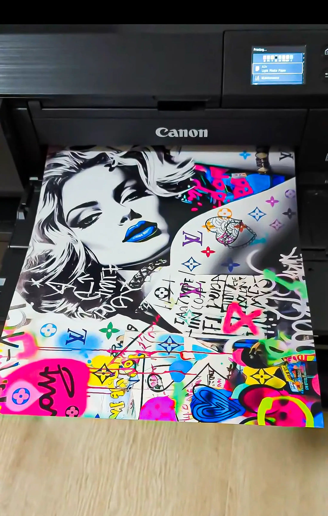
Today's professional inkjet printers come equipped with 6 to 12 inks—not just CMYK. That includes Photo Cyan, Photo Magenta, Red, Blue, and even Gray or Gloss Optimizers. These allow the printer to reproduce a broader color gamut, including many colors typically exclusive to RGB.
That’s why designing in RGB gives me access to a richer palette—and when I preview using CMYK, I can smartly adjust for how those colors will translate through our specific printer’s expanded capabilities. We've also broken down how we optimize color and print quality in this post: Our Secret to Bright Vivid Prints.

Paper Matters, Too
The paper you print on can dramatically affect how colors appear.
- Glossy Paper: Maximizes color vibrancy and contrast. Best for bright, saturated prints, but can produce glare.
- Matte Paper: Offers a soft, understated look. Great for subtle tones and fine art, but slightly mutes colors.
- Semi-Gloss / Satin Paper: This is our go-to for most of our vibrant artwork. It offers the perfect balance—rich color reproduction with minimal glare and a professional finish.
We always select paper based on the tone and mood of the artwork. For high-impact, color-rich designs, semi-gloss is our secret weapon.
My First Canon Printer: Where It All Started
When I first got serious about printing, I invested in a Canon PIXMA Pro-200. It’s an older model now, but it was a game-changer for me. It featured an 8-color dye-based ink system—far beyond the standard four-color CMYK setups. I was blown away by how much more vibrant and detailed the prints looked.
That printer taught me the value of using the right equipment and the right process. And while our art is printed using much newer advanced printers, I’ll always appreciate what that first printer showed me: good design and good tools are both essential to amazing prints.
The Bottom Line: Color is a Craft
Designing for print is about more than just hitting "export." It’s a thoughtful, layered process that blends creative freedom with technical precision. From working in RGB with CMYK previews, to printing with expanded ink systems on carefully selected paper, every decision we make is about honoring the original vision—and delivering a print that liv